
Verify Page Designer: Design Your Public Verification Page
Time to read: 7 minutes
Overview
Your organization has a public verify page where anyone can look up a credential and confirm it's genuine. By default it uses CertLister's standard layout. The Verify Page Designer lets you replace the landing area with a fully custom design — hero sections in your colors, your logos, stats, an FAQ, links to your website — built with a drag-and-drop editor, no code. The public verification features page shows what visitors see before you change anything.
Building a design and previewing it are on every plan. Putting one on your live verify page — Publish and Activate — is on the Pro plan.
One thing never changes: the credential lookup — the search box visitors use to verify a credential — is part of every design. You decide where it sits and what surrounds it, but it can't be removed.
| Plan | Build and preview on any plan · publish and activate on Pro |
| Designs per organization | Up to 5 (one active at a time) |
| Where | Verification Page → Designer tab |
| Applies to | Your public verify page — on certlister.com and on your custom domain |
Create a Design
- Log in to CertLister
- Go to Verification Page in the left navigation
- Open the Designer tab
- Click New design
The template gallery opens with live previews:
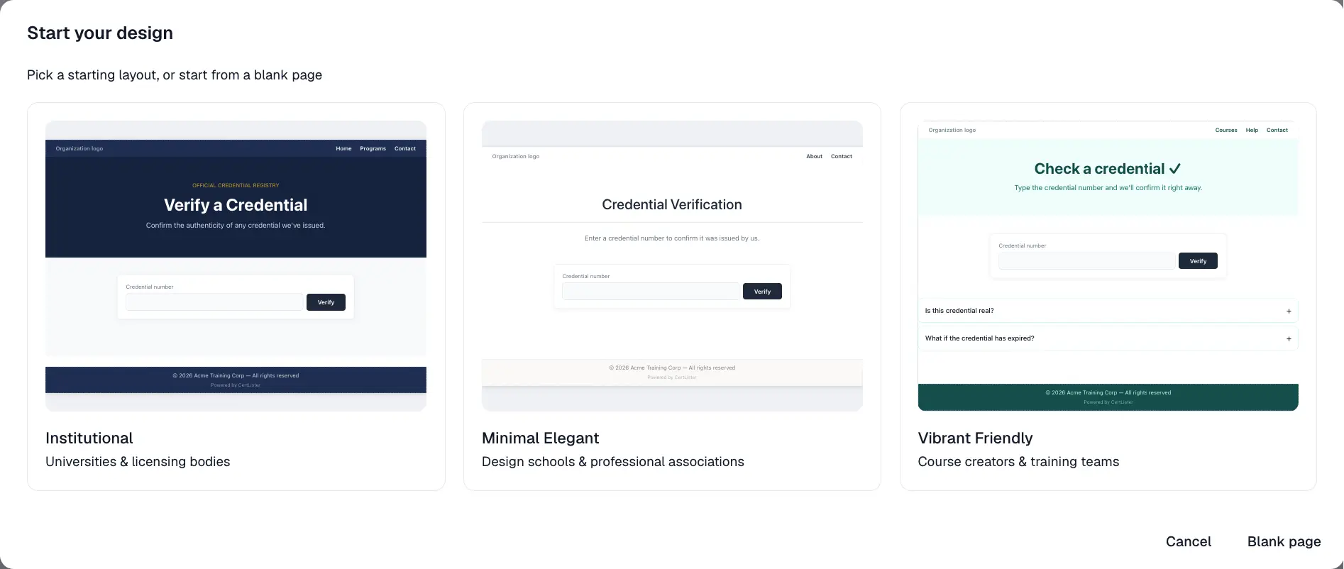
| Template | Look | Made for |
|---|---|---|
| Institutional | Navy and gold, formal registry style, with an "Accredited by" logo row | Universities & licensing bodies |
| Minimal Elegant | White, ink and sand, whitespace-led | Design schools & professional associations |
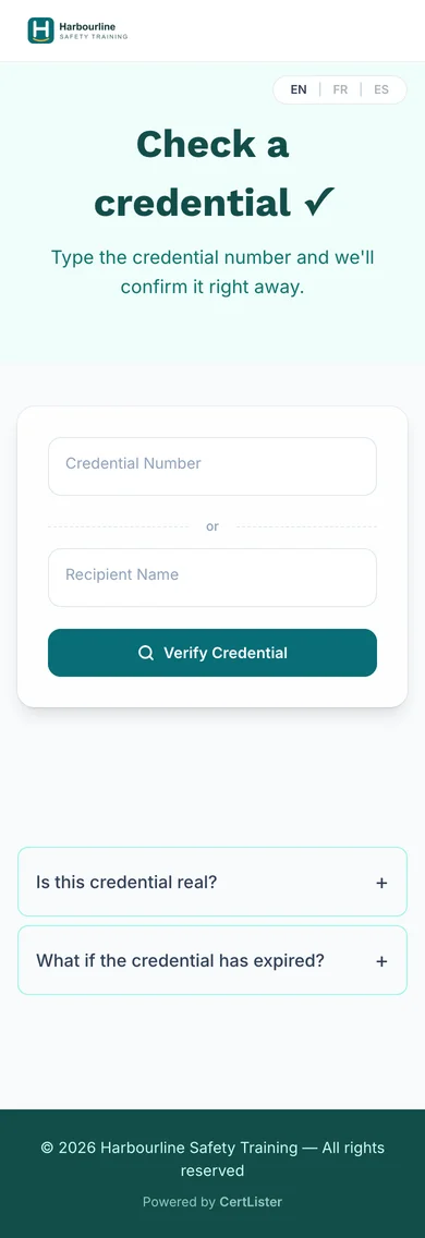
| Vibrant Friendly | Light teal hero with a pre-filled FAQ | Course creators & training teams |
| Blank page | Just the credential lookup | Starting from scratch |
Pick one and the design is created immediately — auto-named ("Institutional 1", "Institutional 2", …) — and the editor opens with the exact layout you previewed. To rename a design later, open its ⋯ menu in the Designer tab and choose Rename.
Templates are personalized when inserted: the footer copyright is pre-filled with your organization name and the current year, and all text is inserted in your account's interface language (English, French or Spanish).
Make the Template Yours
Every template publishes successfully as-is, but before going live you'll want to:
- Add your own links. Template headers start with no links. Add your Home, About or Contact pages under the page's Links setting.
- Edit the headings and text. The template copy is generic on purpose.
- Add logos (Institutional). The "Accredited by" logo row ships empty and simply doesn't appear on the public page until you add logos to it.
The Editor
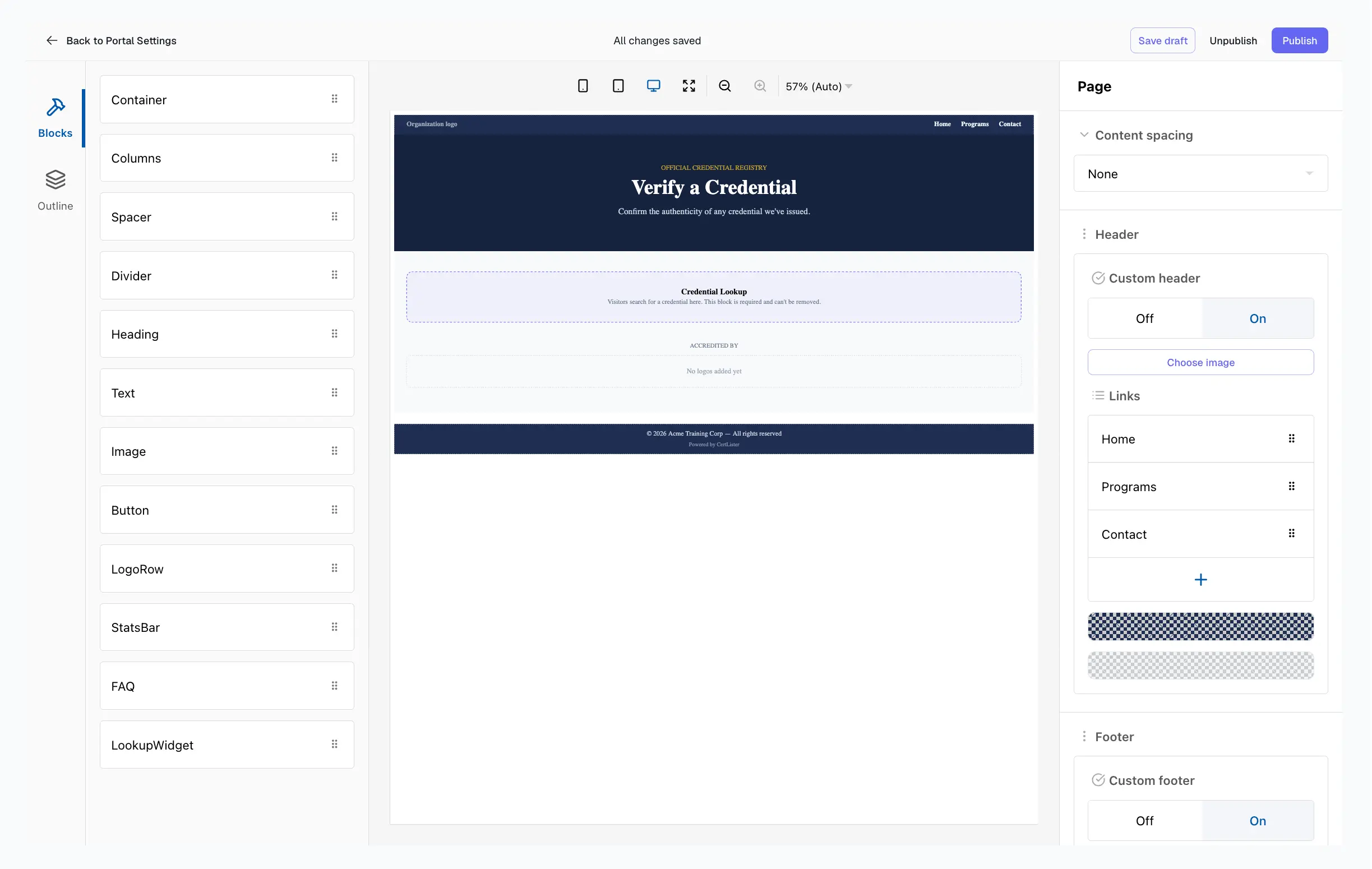
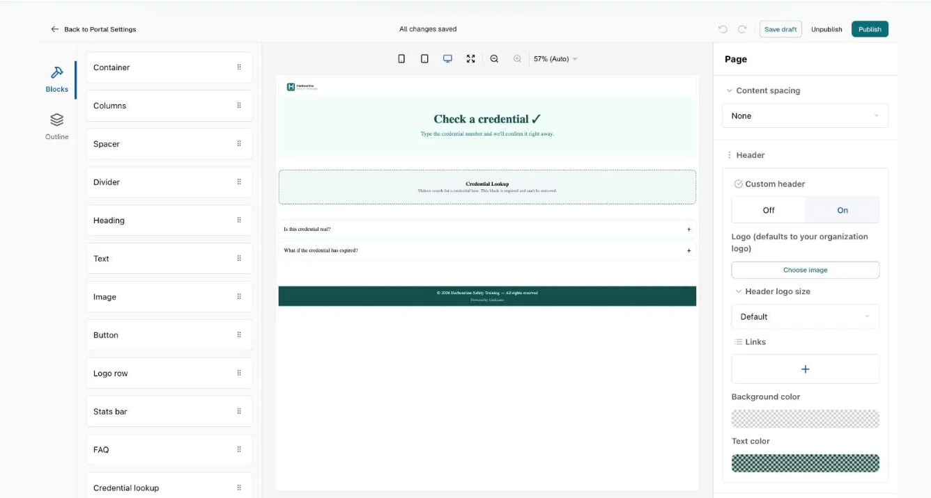
The editor has three areas:
- Left — the list of blocks, grouped into Layout and Content. Drag a block onto the canvas to add it.
- Center — the canvas, a live rendering of your page. Click any block to select it; drag blocks to reorder them.
- Right — the settings for the selected block (text, colors, spacing, alignment, …). When nothing is selected, it shows the page-level settings (header, footer, and content spacing).
The top bar has undo and redo, Save draft, Unpublish (once the design has been published) and Publish, and shows whether you have unsaved changes. There is no preview button in the editor — preview a design from its ⋯ menu in the Designer tab (see below). Back to Verification Page returns to the design list — you'll be warned if unsaved changes would be lost. If you leave another way, such as the browser's Back button, the editor keeps your unsaved changes in this browser and offers to restore them the next time you open the design.
The editor needs a window at least 900 pixels wide. In a narrower window it shows a "needs a wider screen" notice instead; widen the window and your unsaved changes are still there.
Blocks
| Block | What it does |
|---|---|
| Container | A wrapper with its own background color and padding — the building block for colored hero sections |
| Columns | Places blocks side by side |
| Spacer | Adds vertical space |
| Divider | A horizontal line (solid, dashed, or dotted) |
| Heading | A title (three sizes) with alignment, size, and color controls |
| Text | A paragraph with alignment, size, and color controls |
| Image | An image from your uploaded files |
| Button | A link button with shape, size, and color options |
| Logo row | A row of logos with an optional title — partner or accreditation logos |
| Stats bar | A row of headline numbers ("12,000 credentials issued") |
| FAQ | An expandable question-and-answer list |
| Credential lookup | The credential lookup — required, exactly one per design. It can be moved but not deleted or duplicated, so it isn't in the block list |
Images
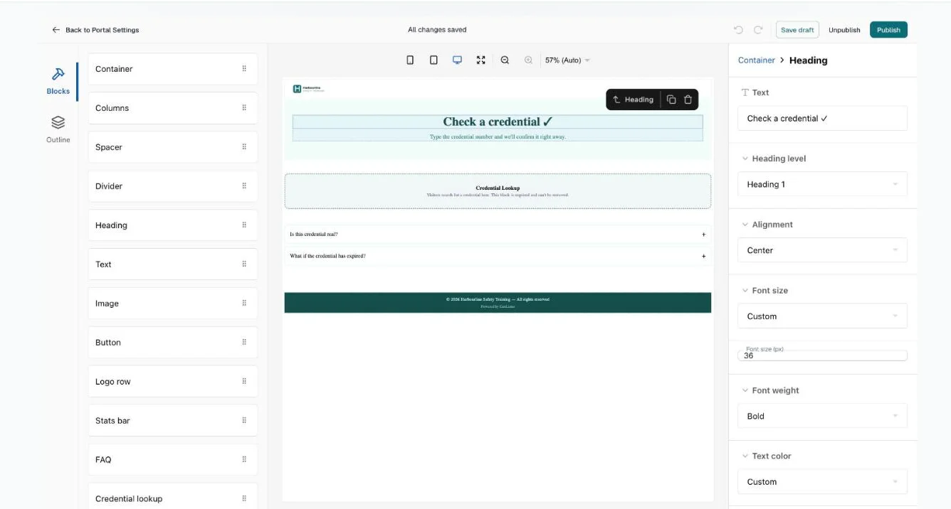
The Image block (and the header logo) use your organization's image library. Click Choose image to pick a previously uploaded file or Upload new image to add one; Remove image clears the field. Only images uploaded to your organization can be published in a design.
Each image in the library shows its file name and a delete button. The library is shared with Design Studio, so an image that a design still uses — a verify page design or a credential design — can't be deleted, and the library says where it is used.
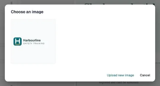
Uploading images is on the Pro plan. On Free and Basic the Upload new image button is locked and you can still use any image already in your library — every other block works normally.
Header and Footer
With no block selected, the right panel shows the page settings:
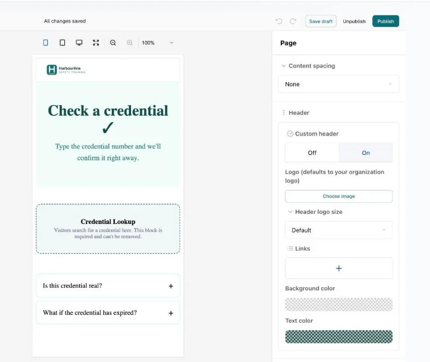
- Custom header — choose On to add a header bar with a logo, up to 5 links, and background/text colors. Leave the logo empty and your organization logo is used automatically.
- Header logo size — the header logo is 32 px tall unless you change it. Pick Small, Medium, Large or Extra large, or pick Custom and set a height from 16 to 120 px. On a phone a logo taller than 72 px is shown at 72 px.
- Custom footer — choose On to add a footer with text (the © line, pre-filled by templates) and up to 8 links.
- Content spacing — the gap between the top of the page (or the header) and your first block.
Header and footer links must be full URLs starting with https://.
Show or Hide Blocks per Device
Every block except the credential lookup has Hide on mobile and Hide on desktop settings, in the block's settings panel on the right. Use them to serve a compact layout to phones — for example, hide a wide three-column section on mobile and show a single stacked alternative instead.
Save, Preview, Publish, Activate
Each design shows its status next to its name in the Designer tab:
| Status | Meaning |
|---|---|
| Draft saved, not published | Your edits are stored, nothing is public |
| Published | A snapshot of the design is ready to serve |
| Unpublished changes | Published, and the draft has edits made since |
The design's Active switch, on the same row, decides whether visitors see it.
- Save draft stores your work. Saving never changes your public page.
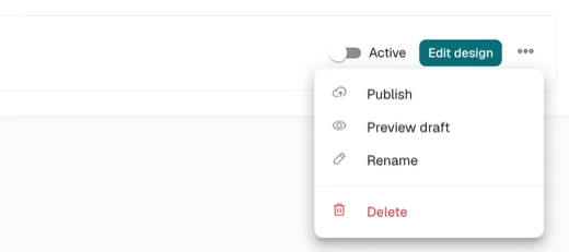
- Preview draft — in Verification Page → Designer, open the design's ⋯ menu — opens your real verify page rendering the current draft through a preview link that works for 10 minutes — you see exactly what visitors would get, while actual visitors keep seeing your current page. Preview any design this way, not just the active one. The draft must pass the same check as Publish; if something needs fixing, the message says what.
- Publish validates the design and takes a snapshot. You can keep editing afterwards — further changes stay in the draft until you publish again.
- Switching Active on makes a published design the one visitors see. Only one design is active at a time: if another design is live, the app asks before it replaces it.
- Switching Active off, or Unpublish, returns your verify page to the layout chosen on the Appearance tab. Unpublishing keeps your draft, so you can pick the work back up later.
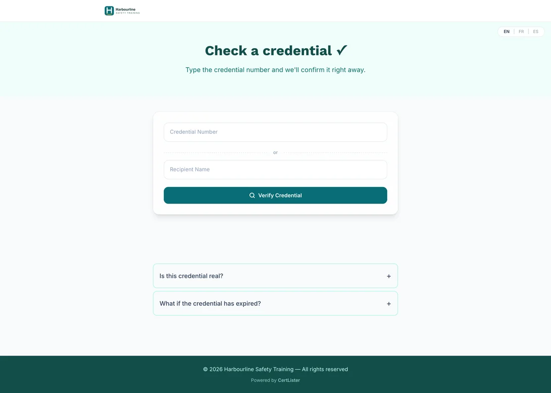
Once it is active, visitors see your design:
Troubleshooting
Publish fails with a validation message
Publishing checks the design first. If something is wrong, the message says what and where — for example "The page footer has a link that isn't a full web address starting with https://" — and the editor selects that block, so its settings open on the right. Show me selects it again. The common causes:
- A link isn't a full web address. Header, footer, and Button links must start with
https://and include the site —www.example.com,/aboutor a barehttps://won't pass. A new Button starts with a barehttps://, so fill it in. - A colour is incomplete. Pick it again, or type all six digits after the
#. - An image isn't from your library. Images must be files uploaded to your organization. Re-add the image through Choose image.
- The credential lookup is missing or duplicated. It can't be deleted or duplicated in the editor any more, so this only happens to a design saved before that. Opening the design adds a missing one back; delete an extra one.
A header or footer that is switched off is not checked, since visitors never see it.
My changes aren't on the public page
Saving a draft doesn't update the public page — click Publish. If the page still shows the standard layout, check that its Active switch is on — Published alone is not enough.
"Can't delete the active design"
Switch its Active switch off first, then delete it.
The Active switch is disabled
The design has no published version yet — the tooltip says "Publish this design before activating it". Publish it first.
"You have 5 designs, the most you can keep"
Delete a design you no longer need from its ⋯ menu.
Publish asks me to upgrade
Publishing and activating a design are on the Pro plan. Everything up to that point — creating, editing, and Preview draft — works on any plan, and your work is saved. See Plans & Billing.
FAQ
Q: Does my design work on my custom domain?
A: Yes. The design applies to your verify page wherever it's served — certlister.com or your custom domain.
Q: Does the design change my embedded verification widget?
A: No. The embedded widget on your own website is unaffected — the design applies to your full verify page.
Q: Does the design change how credential results look?
A: No. The designer covers the landing area around the credential search. The result card that appears after a search is configured separately in Verification Page: its layout on the Appearance tab, its buttons on Options, and its field names on Field labels.
Q: Can I change the fonts?
A: No — designs use the verify page's standard typeface. Identity comes from your colors, text sizes, weights, and spacing.
Q: Can visitors see my drafts?
A: No. Drafts are only visible through your Preview draft link, which stops working after 10 minutes. Until then anyone who has the link can open it, so share it with care. A preview carries a banner across the top that says it is a draft preview, so it can't be mistaken for your real page. Visitors always see the active published design.
Q: What happens if I downgrade from Pro?
A: Your verify page returns to the layout chosen on the Appearance tab automatically. Your designs aren't deleted, and you can still open, edit and preview them — upgrade again and the active design resumes serving. Unpublish, switching Active off, and Delete keep working on any plan, so you are never stuck with a page you can't take down.
Q: Can several team members edit designs?
A: Yes — any team member with the Admin role can use the designer.